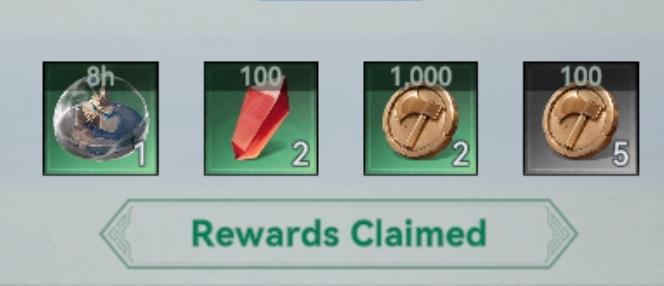
welcome gift rewards claimed
Description
The user interface (UI) in the image presents a rewards summary, showcasing several collectible items.
Features and Labels:
-
Item Display:
- Each item is presented in a grid format, which allows for easy visual scanning.
- Items include an hourglass icon, a red crystal-like item, a gold coin, and a silver coin, each having their respective quantities indicated.
-
Quantities:
- Each item features a numeric label, showing how many of each item the user has claimed. For example, the first item has "1" next to it, indicating a single unit, while the gold coin shows "2".
-
Time Indicator:
- The first item has "8h" next to it, likely indicating a duration related to the reward, such as the time needed to earn or use it.
-
Rewards Claimed Label:
- At the bottom, there is a prominent label "Rewards Claimed" in a bold font, which highlights the function of this UI section as a summary of items that have been collected. This label has a contrasting color to ensure visibility.
-
Visual Style:
- The overall form is clean and minimalistic, using a muted background color that emphasizes the items and their labels, enhancing readability and focus.
This UI efficiently communicates the collected rewards, making it user-friendly for quick assessments of the player's gains.
Software
Viking Rise
Language
English
Created by
Sponsored
Similar images
claim welcome gift
Viking Rise
The user interface (UI) in the image is designed to welcome users to a game focused on a Viking theme. Here’s a breakdown of the labels and features: 1. Head...
welcome to tutorial
Heroes of Might and Magic 3: Complete
The interface in the image showcases the tutorial screen for "Heroes of Might and Magic III." Here’s a breakdown of its key features: 1. Central Tutorial Mes...
alert: orders ready to complete
Against the Storm
The interface features a notification panel titled "Alerts," prominently displayed at the top. This label indicates its function as a system for tracking import...
music player
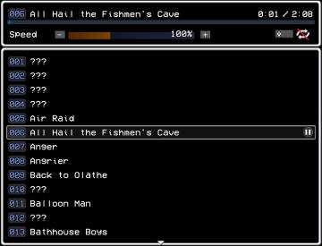
LISA: The Painful - Definitive Edition
The UI features a simple, darkthemed layout that emphasizes clarity and ease of navigation. It consists of several key elements: 1. Title and Progress Bar...
selected mutation loadout is activated

Grounded
The user interface features a labeled section for “MUTATION LOADOUTS,” with options from A to D clearly indicated at the top. The highlighted letter “A” signifi...
quick battle, 2 sappers, attack, support, defense
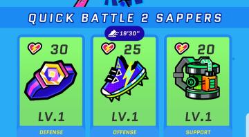
Run Legends
The UI in the picture features a colorful and vibrant design, utilizing a playful aesthetic that suits a gaming environment. 1. Top Section: Title...
tento krucifix zastavil útok
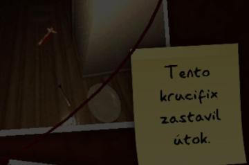
Phasmophobia
V uživatelském rozhraní (UI) obrázku můžeme vidět jednoduchý a funkční design. Hlavním prvkem je žlutý papírek se psaným textem, který říká: "Tento krucifix zas...
ghost, horror game tasks, refreshes at
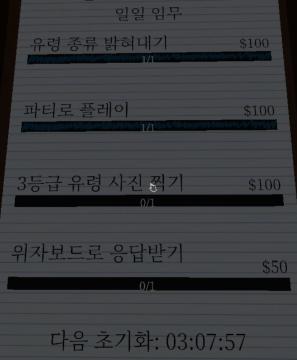
Phasmophobia
화면에는 여러 UI 라벨과 기능이 나열되어 있습니다. 각 항목은 주로 게임이나 작업의 미션을 나타내며, 다음과 같은 특성이 있습니다: 1. 일일 임무 상단에 위치하...
 matej94v