you died: continue or exit to main menu
Description
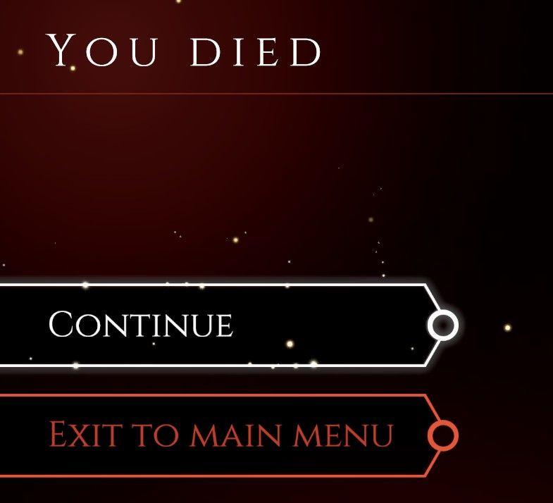
The user interface (UI) in the picture displays a game over screen, characterized by a dark red background with a subtle sparkle effect, contributing to a dramatic aesthetic.
At the top of the screen, the label "YOU DIED" is prominently featured in a large, bold font, emphasizing the failure state in the game. This stark text serves to immediately convey the message of the player's defeat.
Below this, there are two buttons, designed for player interaction:
-
Continue: This button is situated in a black rectangular box, bordered in white. The text is centered and written in a clear, white font. The simplicity of the form contrasts the gravity of the message above, suggesting a pathway back into the game.
-
Exit to main menu: This button is presented in a red rectangular box, with the text in a similarly clear but larger font, creating a visual distinction from the "Continue" option. The color choice likely indicates a more serious decision, aligning with the concept of exiting out of the current gameplay.
Both buttons feature rounded edges, giving them a modern and approachable look, while the spacing between them allows for easy navigation and selection. Overall, the design effectively combines functionality with an engaging visual style that reflects the game's atmosphere.
Software
Mages of Mystralia
Language
English
Created by
 M S
M S
Sponsored
Similar images
against the storm main menu, discord
Against the Storm
The UI features a symmetrical layout with three main buttons prominently displayed at the center: "Play," "Options," and "Quit." Play: This button featu...
snakebird main menu start exit credits options
Snakebird
The UI in the image features a colorful and playful design, aligning with the game’s whimsical theme. The main title, "Snakebird COMPLETE," is prominently displ...
main menu メニュー
Phasmophobia
この画像には、さまざまな機能を示すUIラベルが含まれています。それぞれのラベルは、機能を明確に示すためにシンプルな形式で作られています。 1. シングルプレイヤー...
main menu: start new career, exit, extras
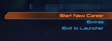
Mass Effect 1
The UI presents three main labels with distinct functions, each crafted for clarity and ease of navigation. 1. Start New Career: This primary option, highl...
hades 2 early access main menu
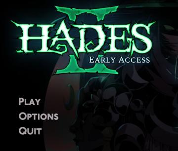
Hades II Early Access
The user interface features a dark and atmospheric design that complements the game's theme. At the top, the title "HADES II" is prominently displayed in a styl...
main menu, TOEM
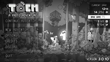
TOEM
The user interface (UI) in the picture features a whimsical, monochromatic design that suits the game's playful theme as a photo adventure. Here’s a breakdown o...
main menu
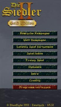
The Settlers II
Im Bild befinden sich die Benutzeroberflächenlabels und Funktionen des Spiels "Die Siedler II: Gold Edition". Am oberen Rand wird der Titel "Die Siedler II" i...
main menu, single player or multiplayer, credits, options
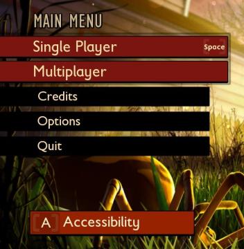
Grounded
The user interface (UI) features a clean layout with a bold, central title labeled "MAIN MENU" at the top, indicating the primary navigation area for the user....