emergency app profile settings
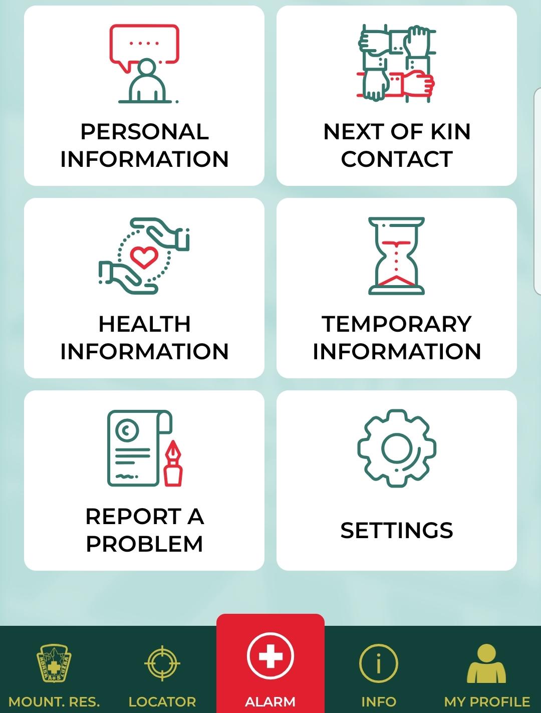
Description
The UI displayed in the picture consists of several clearly labeled sections, designed for easy navigation and immediate access to various functions. Each section is represented by an icon and a label, enhancing usability. Here’s a breakdown of the features:
-
Personal Information: This section likely allows users to manage their personal details, such as name, address, and contact information.
-
Next of Kin Contact: This feature helps users store essential contact details of emergency contacts, ensuring they can be reached in urgent situations.
-
Health Information: This area is designed for inputting and accessing health-related data, which may include medical history, allergies, or medications.
-
Temporary Information: This section likely functions to store data that may not be permanent, such as temporary addresses or short-term medical conditions.
-
Report a Problem: This feature seems to provide users with a way to notify the support team about any issues or concerns they may encounter, promoting user engagement and improved service.
-
Settings: This area allows users to customize application settings according to their preferences, such as notifications or account settings.
At the bottom of the interface, there are additional icons:
- Mount. Res. (Mountain Rescue?): Suggesting location-based features, likely for rescue or assistance services.
- Locator: This could provide users with navigation support to find their current location or an important destination.
- Info: Presumably links to additional information about the app or services.
- My Profile: This section likely directs users to their profile management.
The alarm button, prominently placed in the center with a red color, indicates its importance for immediate action, likely connecting to an emergency call or alert feature.
Overall, the interface is function-focused, with intuitive icons and clear labeling, designed to facilitate quick access to vital information and features. The color scheme and layout appear modern and user-friendly, emphasizing clarity and ease of use.
Software
Zachranka
Language
English
Created by
 matej94v
Sponsored
Similar images
mountain service emergency app
Zachranka
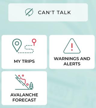
The UI presents a clean and userfriendly layout, focusing on functionality with straightforward labels. 1. Can't Talk: This prominent label at the top in...
emergency app instructions how to
Zachranka
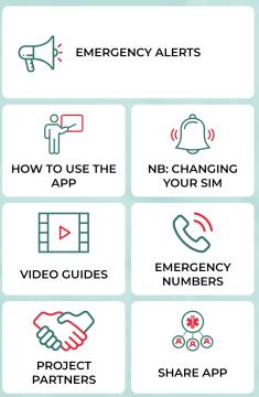
The user interface (UI) displayed in the picture consists of several labeled sections, each featuring specific functions related to emergency preparedness and a...
mountain service emergency app
Zachranka
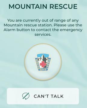
The user interface (UI) in the picture is designed for a mountain rescue communication app. Here’s a breakdown of its labels and features: 1. Title "MOUNTA...
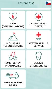
locator, nearest hospitals, emergency contacts
Zachranka
The UI presents a clean and organized layout categorized under the title "LOCATOR," with a flag icon indicating language or location (Czech Republic). Each feat...
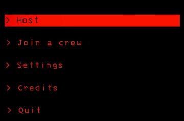
host game, join a crew, settings, main menu
Lethal Company
The interface features a predominantly black background, creating a stark contrast with red and white text, which enhances readability. Host: This label...
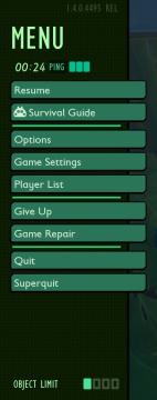
in-game menu quit, super-quit, respawn, options and settings
Grounded
The UI presents a structured menu labeled "MENU," positioned prominently at the top. Directly beneath this label is the timer displaying elapsed time (00:24) al...
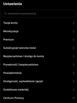
settings categories
x.com
Interfejs przedstawia sekcję ustawień aplikacji. W górnej części znajduje się pole wyszukiwania oznaczone jako "Ustawienia wyszukiwania", co umożliwia szybkie z...
security settings
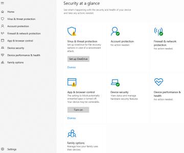
Windows 10
The image displays a user interface (UI) for a security management section, labeled "Security at a glance." This UI is designed to provide an overview of the se...