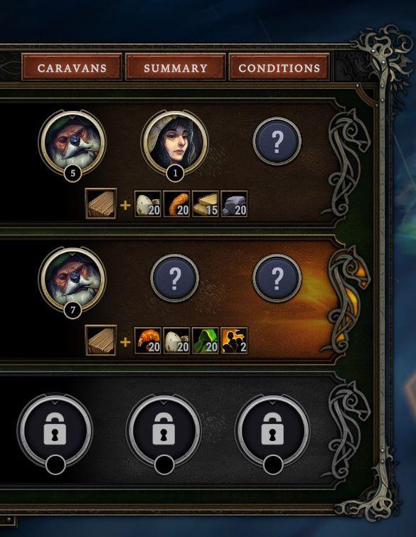
caravans, summary, conditions
Description
The user interface (UI) in the image features a structured layout with several key labels and elements. The top section includes three main buttons labeled "CARAVANS," "SUMMARY," and "CONDITIONS." These likely serve as navigation options to access different parts of the application.
Below, two main rows display caravan details. Each has circular portraits representing characters, accompanied by a number indicating their level or status. Next to each character, there are icons representing various resources or items, with corresponding numerical values denoting quantities.
Additionally, question mark icons are present, suggesting informative pop-ups or tooltips available for users seeking more information about certain elements.
At the bottom, three locked icons indicate features or options that are currently inaccessible to the user. The design employs a decorative border, incorporating curved lines and ornate details, enhancing its aesthetic appeal while maintaining clarity in functionality.
Software
Against the Storm
Language
English
Created by
 M S
M S
Sponsored
Similar images
pick stonecutters' camp blueprint
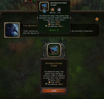
Against the Storm
The UI presents several key elements necessary for navigation and interaction. At the top, there are numerical indicators that likely represent resources or sta...
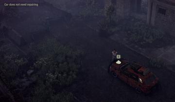
car does not need repairing
The Last Stand: Aftermath
In the UI of the image, the key features include: 1. Text Notification: There’s a label at the top left reading "Car does not need repairing." This serves...
オススメ自社アプリ

のこのこキノコ
この画像には、UIラベルと機能がいくつか含まれています。 1. メインラベル: 「オススメ自社アプリ」と書かれており、特定のアプリをおすすめするセクションであるこ...
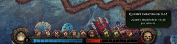
queen's impatience per minute
Against the Storm
The UI features a horizontal status bar at the bottom, showcasing two distinct segments: a blue section on the left, representing a form of progress or resource...
esc to skip

Cursed to Golf
The UI features a simple text label positioned against a dark background, enhancing readability. The prominent label reads "Esc to Skip," indicating functionali...
talk to doctor Chakwas prompt
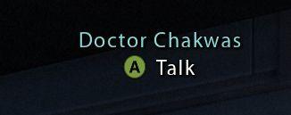
Mass Effect 1
The UI features a label with the name "Doctor Chakwas," indicating the character or NPC being referred to. The text is presented in a clean, modern font, enhanc...
Failed you annoyed disturbed the camp inhabitants
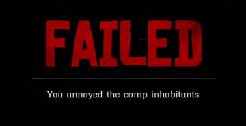
Red Dead Redemption 2
The UI features a bold red label at the top that reads "FAILED," which immediately conveys the message of unsuccessful action, drawing attention through its lar...
join privat lobby
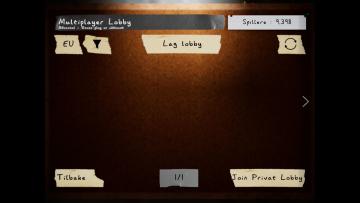
Phasmophobia
På bildet vises en brukergrensesnitt for en multiplayerlobby. Øverst finnes overskriften "Multiplayer Lobby" i en leken typografi, som indikerer at dette er en...