cursed to golf course
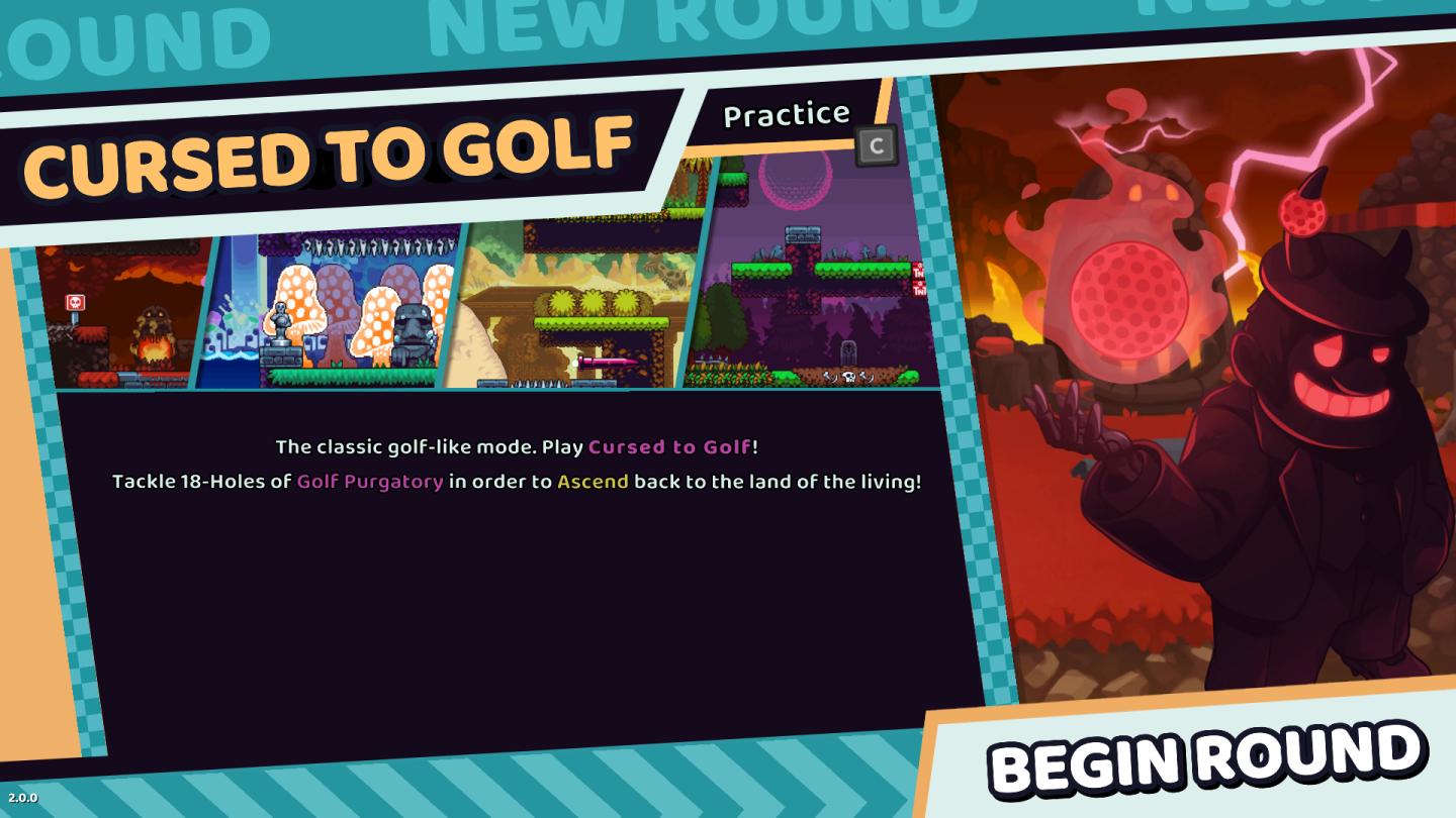
Description
The user interface (UI) in the picture features several key elements that enhance user interaction and navigation:
-
Main Title - "CURSED TO GOLF": This prominently displayed title indicates the game mode. It uses a bold, playful font that suggests a fun and possibly whimsical experience.
-
Subheading - "The classic golf-like mode.": This provides context about the gameplay, clarifying that it is reminiscent of traditional golf.
-
Game Description: Below the title, there’s a brief explanation encouraging players to "Tackle 18-Holes of Golf Purgatory." This uses bright, eye-catching colors (like pink and yellow) to highlight key terms ("Cursed to Golf" and "Ascend"), making it more engaging.
-
Thumbnail Previews: On the top left, there are four thumbnail images representing different holes or environments within the game. These serve to visually entice players, showcasing variety and engagement.
-
Buttons:
- "PRACTICE" Button: This is indicative of a training mode, allowing users to improve their skills before entering the main game.
- "BEGIN ROUND" Button: Located at the bottom right, this large, brightly colored button invites players to start the game. Its placement suggests an action-oriented prompt, making it easy to locate and click.
-
Navigation Labels: The labels for "NEW ROUND" and "ROUND" at the top suggest other options available within the game, guiding users on possible actions.
Overall, the UI is colorful and visually appealing, with a mix of playful graphics and functional labels that facilitate easy navigation and understanding of the game’s objectives.
Software
Cursed to Golf
Language
English
Created by
 M S
M S
Tags
Sponsored
Similar images
全ての記事 未読 all articles unread articles
Inoreader
この画像には、主に次のUIラベルと機能があります。 1. メニューボタン(三本線アイコン): 機能:メニューを開くためのボタンで、他のオプションやページにア...
in-game main menu, load, save, restart
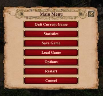
Age of Empires 2 Definitive Edition
The interface presents a Main Menu with a classic, vintage aesthetic, highlighted by ornamental borders and a textured background. The menu features a centraliz...
connecting to server
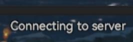
Viking Rise
The UI label "Connecting to server" indicates that the application is attempting to establish a connection with a server. This label serves a functional purpose...
failed. the law were alerted
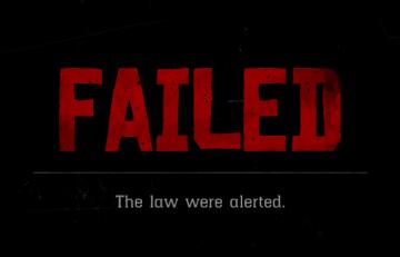
Red Dead Redemption 2
The UI in the picture features bold, oversized text that prominently displays the word "FAILED" in a striking red color, which conveys a sense of urgency and ne...
gameplay options, toggle crouch, difficulty, tik tok friendly mode
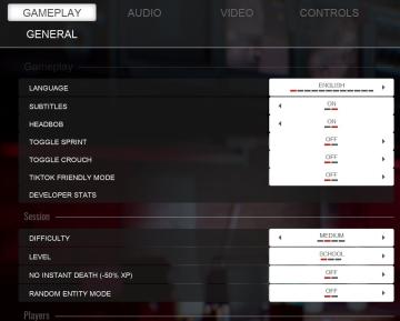
Panicore
The UI in the picture features a settings menu primarily for gameplay options with specific categories related to game functionality. Here's a breakdown of the...
use of a controller is recommended
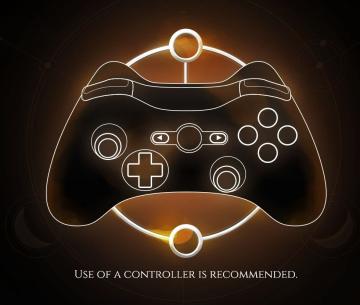
Mages of Mystralia
The image features a simplified outline of a game controller, likely intended for gaming interface instructions. UI Labels and Features: 1. Controller...
メイン画面
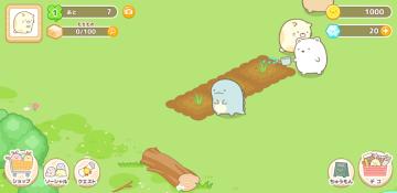
Sumikko Farm
この画像のUIラベルと機能について説明します。 1. 上部バー: レベル表示: 「1」という数字が表示されており、プレイヤーのレベルを示します。 アイ...
autosave feature
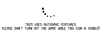
TOEM
The UI in the image features two main components: an animated icon and a message regarding autosave functionality. 1. Animated Icon: The icon consists of s...