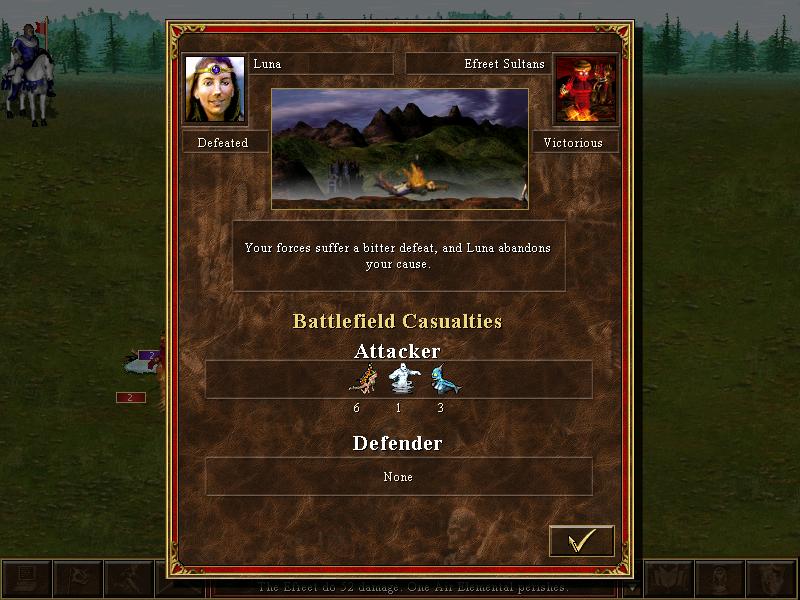
your forces suffer a bitter defeat and luna abandons your cause
Description
The user interface (UI) in the image depicts the aftermath of a battle in a strategy game. Here’s a breakdown of the key labels and features:
-
Character Names and Status:
- Luna (Defeated) and Effreet Sultans (Victorious) are prominently displayed at the top. The use of contrasting labels (Defeated vs. Victorious) clearly communicates the outcomes for each character.
-
Battle Outcome Description:
- A text box summarizing the battle result states, "Your forces suffer a bitter defeat, and Luna abandons your cause." This serves to provide narrative context about the defeat.
-
Image Representation:
- An image of the battlefield scene appears between the character names, illustrating the setting and aftermath of the conflict. This adds visual engagement to the UI.
-
Battlefield Casualties Section:
- Below the outcome description, the "Battlefield Casualties" label divides the casualties into two sections: Attacker and Defender. This segmentation helps users quickly identify losses on each side.
-
Casualty Counts:
- Under the Attacker label, counts of different units are shown (e.g., 6, 1, 3). Icons representing these units accompany the numbers, which enhances clarity for users by visually relating numbers to unit types. The Defender section shows "None," indicating no losses for the victorious side.
-
Action Button:
- A checkmark button at the bottom allows users to confirm or proceed from this battle summary interface. Its simple design integrates seamlessly with the overall form, ensuring it’s easily identifiable as an actionable item.
Overall, the UI effectively conveys information through a combination of text labels, images, and structured layout, making it user-friendly while maintaining a thematic aesthetic appropriate for a strategy game.
Software
Heroes of Might and Magic 3: Complete
Language
English
Created by
 M S
M S
Tags
Sponsored
Similar images
dead after being eaten by the infected
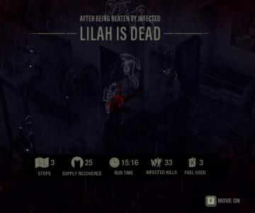
The Last Stand: Aftermath
The user interface (UI) in the picture is designed for a survival or action game, providing essential information and options to the player. Here’s a breakdown...
you can only build one of this building
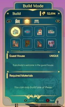
Spiritfarer: Farewell Edition
The interface features a "Build Mode" label at the top, indicating the current mode the player is in. Below this, there are two tab buttons labeled "LB" and "RB...
kupónová aplikace menu, coupon app menu

Lidl Plus
Na obrázku vidíme uživatelské rozhraní aplikace s názvem "Více". Hlavní funkce jsou organizované do seznamu, což usnadňuje uživatelům orientaci. 1. Moje účte...
0 woodcutter's camps built, select or preview building
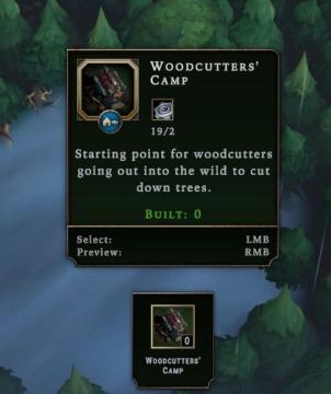
Against the Storm
The user interface features a rectangular panel with a dark background, giving it a structured and clean appearance. Title Label: "WOODCUTTERS' CAMP" pr...
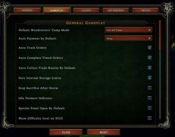
woodcutter tree strategy, gameplay settings
Against the Storm
The user interface (UI) features a labeled list under the "Gameplay" tab, designed for adjusting various game settings. The primary function is to allow players...
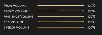
main (master) volume, music volume, ambience volume..
Hades II Early Access
The user interface features a series of horizontal sliders corresponding to different sound settings, each labeled clearly for ease of understanding. 1. Mai...
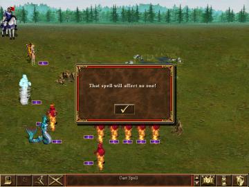
that spell will affect no one
Heroes of Might and Magic 3: Complete
In the UI of the image, we can see several key labels and features that play a crucial role in gameplay: 1. Spell Notification Box: The central feature is...
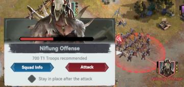
niflung offense
Viking Rise
The user interface (UI) in the image appears to be from a realtime strategy game. Here’s a breakdown of its labels and features: 1. Title Bar: "Niflung Of...