save to album
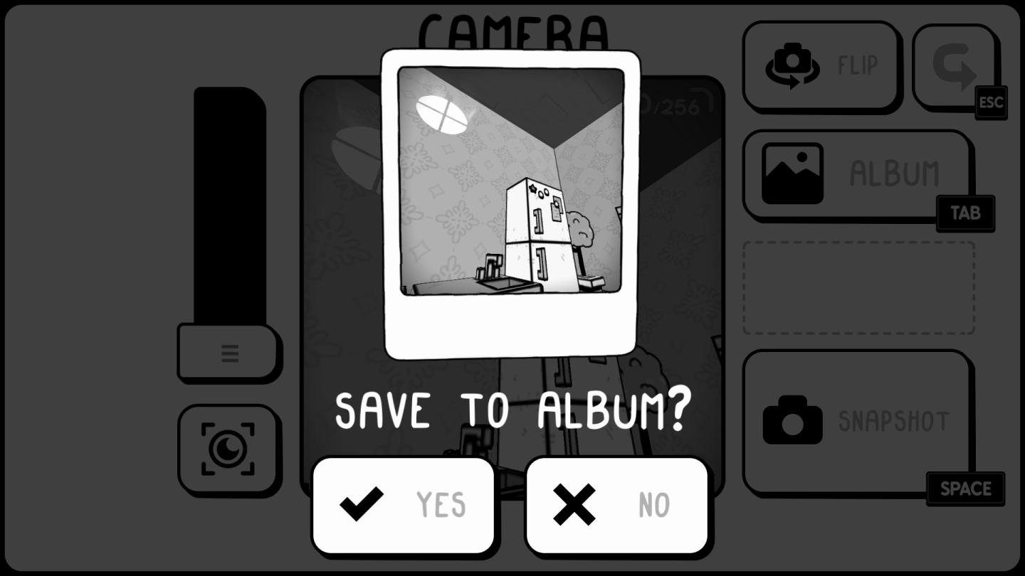
Description
The user interface (UI) displayed has several key labels and features, each serving distinct functions.
-
Title Bar ("CAMERA"): At the top of the interface, this label indicates the current mode or functionality of the app, which relates to capturing or managing images.
-
Image Preview: The central area shows a polaroid-style snapshot, giving a visual context of the image being worked with. This preview allows the user to see what they are about to save or modify.
-
Save Confirmation: The message "SAVE TO ALBUM?" prompts the user to decide whether to save the current image. This is critical for user interaction and ensures they confirm their action.
-
Action Buttons:
- YES (✓): Located below the confirmation message, this button likely initiates saving the image to the album. It's marked with a check icon to signal confirmation.
- NO (✗): Next to the YES button, this option cancels the save action. It’s marked with an X, serving as a clear indicator of negation.
-
Slider on the Left: The vertical slider could relate to adjusting settings such as brightness, contrast, or zoom, though the exact function isn’t clear without further context.
-
Camera Icon Below Slider: This likely serves as a button to capture a new image or take a snapshot.
-
Other Function Buttons:
- FLIP: This button rotates or flips the image, allowing for adjustments to its orientation.
- ALBUM: Represents a section of the app for viewing saved images.
- ESC: A button for exiting or canceling the current task.
- TAB: Likely used to switch between different views or screens in the app.
- SPACE: Positioned next to the “SNAPSHOT” label, this could be a key for capturing an image.
Overall, the design aims for simplicity and clarity, with minimalist aesthetics that prioritize functionality. The monochrome palette reinforces a focused user experience without distractions from colors.
Software
TOEM
Language
English
Created by
 M S
M S
Tags
Sponsored
Similar images
savefile selection, load game
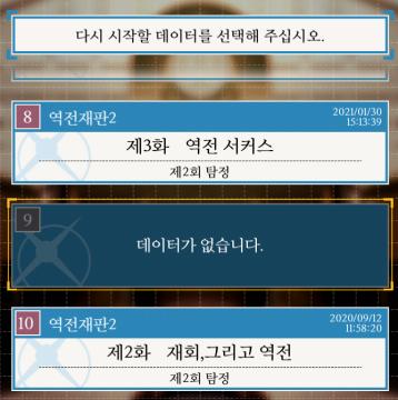
Phoenix Wright: Ace Attorney Trilogy
이 UI에는 여러 특징적인 요소가 있습니다. 1. 메시지 영역: 상단에는 사용자가 선택해야 할 데이터를 요청하는 메시지가 있습니다. 이는 사용자에게 다음 단계로 나...
main menu (save game, load game, settings, exit..)

Duke Nukem 3D Atomic Edition
The user interface (UI) in the image features a bold, stylized title "DUKE NUKEM 3D" prominently displayed at the top, emphasizing the game’s identity. The word...
screen saved (screenshot taken)

Duke Nukem 3D Atomic Edition
The image features a UI label that reads "SCREEN SAVED" prominently displayed at the top. The text is rendered in a bold, blue font, which enhances its visibili...
critical mission failure, resume last save or quit
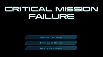
Mass Effect 1
The user interface features a stark black background that emphasizes the text and buttons in a clear and concise manner. At the top, a large, bold heading reads...
transfer your save data to another device

Sumikko Farm
The interface labeled "Transfer Save Data" provides a straightforward method for users to input their User ID and Secret Code for data transfer purposes. U...
are you sure? unsaved data will be lost

Yakuza 0
The UI features displayed in the image depict a confirmation dialog designed to alert the user about unsaved data. Labels and Function: 1. Title Label...
host is loading a save

Grounded
The UI presents a minimalistic and clean design set against a black background. The primary label, "HOST IS LOADING A SAVE," is prominently displayed in large,...
overwrite previous saved game? y/n
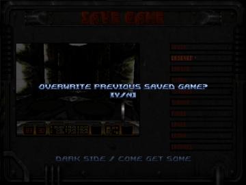
Duke Nukem 3D Atomic Edition
The interface displayed is for a "Save Game" function, featuring a dark, industrial aesthetic that complements the game's theme. The top section prominently fea...