you don't have enough talent points for this upgrade
Description
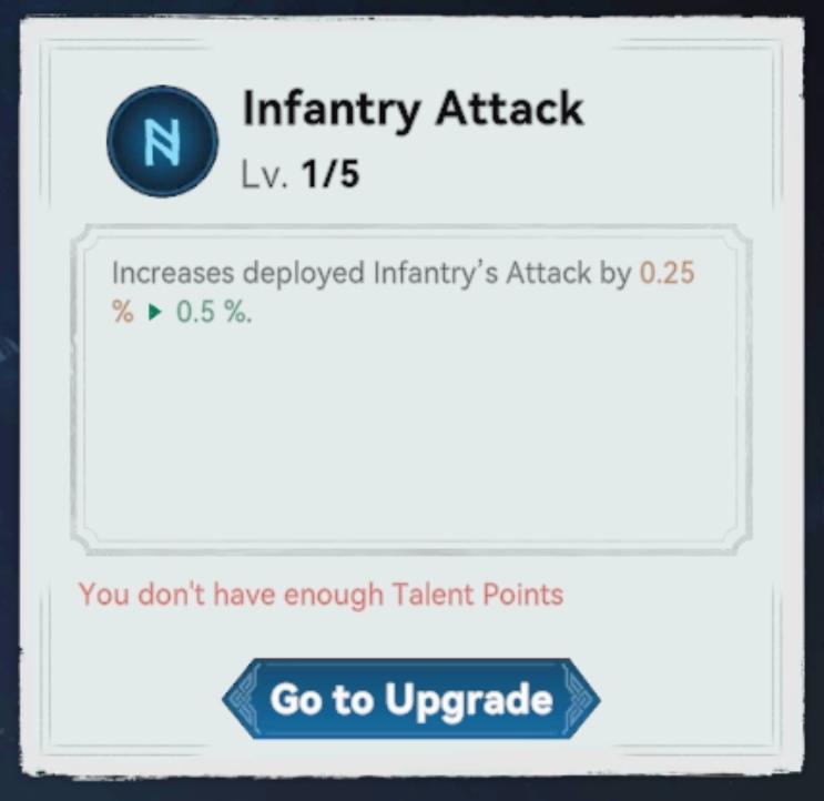
The UI in the image appears to be from a game interface, specifically focused on enhancing an "Infantry Attack" feature. Here’s a breakdown of the labels and functionalities:
-
Header:
- Label: "Infantry Attack" - Indicates the feature being upgraded.
- Level Display: "Lv. 1/5" - Shows the current level of the upgrade and the maximum achievable level.
-
Description Section:
- Text: "Increases deployed Infantry’s Attack by 0.25 %" - Describes the effect of the upgrade, indicating a quantitative improvement in attack strength for infantry units.
-
Effect Preview:
- Change Indicator: The arrow pointing to "0.5 %" suggests a potential future increase in attack power, possibly if the user levels up the ability further.
-
Upgrade Status:
- Message: "You don't have enough Talent Points" - This alert signals the user that they cannot upgrade due to insufficient resources (Talent Points).
-
Action Button:
- Label: "Go to Upgrade" - This button likely navigates the player to a section where they can earn or manage Talent Points, facilitating the upgrade process.
Form Aspects:
- Color Scheme: Utilizes contrasting colors (blue for action, red for alerts) to guide user attention appropriately.
- Layout: Clear and structured, making it easy to read and understand the functionalities.
- Icons/Graphics: The use of an icon next to the title may serve to enhance recognition and thematic relevance.
Overall, the UI effectively communicates the necessary information for users to engage with and understand the upgrade mechanics while indicating what is needed for progression.
Software
Viking Rise
Language
English
Created by
 matej94v
Sponsored
Similar images
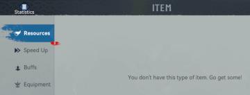
you don't have any item of this type
Viking Rise
The UI presents several key labels and features focused on user navigation and information access. Here's a breakdown of the elements: 1. Title Bar: The wo...
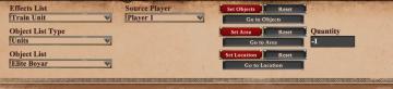
editor scenario, triggers, effect list: add effect for scripted missions
Age of Empires 2 Definitive Edition
The user interface features a series of dropdown menus and buttons, designed for selecting and configuring various game actions. UI Elements: 1. Effect...
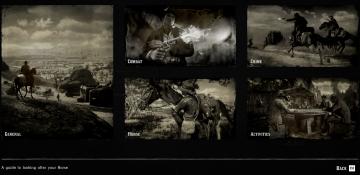
Help, a guide to looking for your hose, manual
Red Dead Redemption 2
The user interface (UI) presented in the image features a grid layout with six distinct sections, each dedicated to specific themes relevant to gameplay. 1. ...
continue (start game)
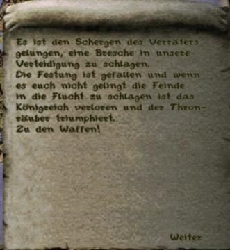
Knights and Merchants
Das Bild zeigt einen Text auf einer texturierten, pergamentartigen Hintergrundoberfläche. Der Text ist in einer klaren, jedoch handschriftlichen Schriftart ve...
mark all entries in codex as viewed
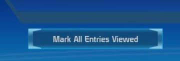
Mass Effect 1
The user interface features a button labeled "Mark All Entries Viewed." This label clearly indicates its functionality, allowing users to mark all entries as ha...
red team wins, victory, end of match
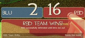
Team Fortress 2
The UI in the image displays a scoreboard for a competitive game, with distinct sections for each team's performance. 1. Team Labels: The labels "BLU...
scenario editor: add triggers, conditions and effects
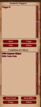
Age of Empires 2 Definitive Edition
The UI features a structured layout intended for managing scenario triggers and effects. 1. Scenario Triggers Section: Label: "Scenario Triggers...
current statistics, rank in random map leaderboard, hover over icon
Age of Empires 2 Definitive Edition
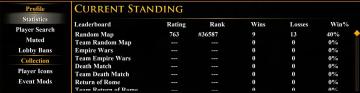
The user interface features multiple sections, primarily organized for easy navigation. At the top, the label "CURRENT STANDING" is prominently displayed in yel...