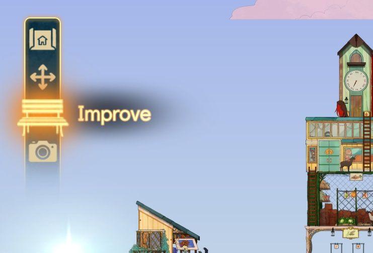
improve menu
Description
The UI on the left side features several icons designed for specific functions.
-
Home Icon: Positioned at the top, this icon likely directs the user back to the main menu or home screen, allowing easy navigation.
-
Arrow Icon: Below the home icon, this arrow seems to represent movement or adjustment, potentially modifying the view or position of elements in the game.
-
Camera Icon: The camera symbol near the bottom suggests a function for taking screenshots or entering a mode to capture images of the game.
-
Improve Button: Centered and highlighted, the "Improve" label indicates a feature for enhancing or upgrading aspects of the player's space or resources. The text is illuminated, drawing attention to its importance.
The overall design is sleek and modern, with a vertical alignment of icons creating an intuitive, organized layout for functionality. The use of light colors against a soft background enhances visibility and accessibility.
Software
Spiritfarer: Farewell Edition
Language
English
Created by
 M S
M S
Sponsored
Similar images
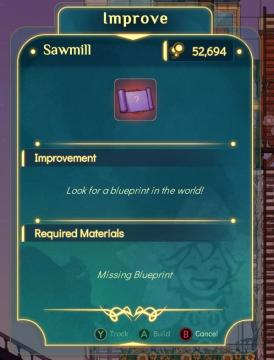
to improve sawmill, look for a blueprint in the world
Spiritfarer: Farewell Edition
Title Area: The top section displays the term "Improve," indicating the function is to upgrade or enhance a specific building or feature. Building Na...
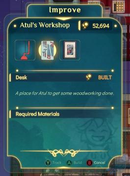
improve Atul's workshop by crafting a desk
Spiritfarer: Farewell Edition
Improve: This label at the top indicates the current function of the screen, allowing players to enhance or upgrade a workshop. Atul's Workshop: Th...
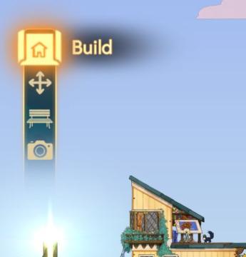
build menu
Spiritfarer: Farewell Edition
The UI features a vertical sidebar with a prominent "Build" label at the top, indicating the primary action available. Below this, there are three icons represe...
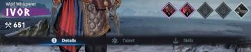
chief details menu, talents and skills
Viking Rise
The user interface (UI) in the image features several functional elements designed for character management in a game setting. 1. Character Name and Title:...
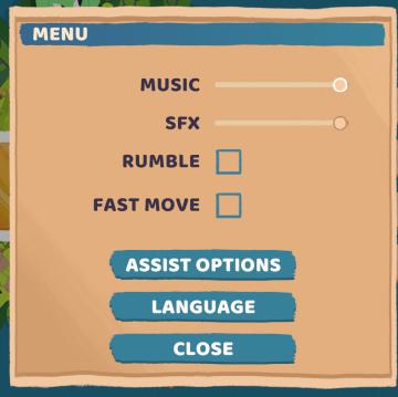
menu
Floppy Knights
The interface displayed is a settings menu, featuring several interactive options organized systematically. Below is an analysis of its labels and features: 1....
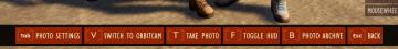
photo mode main menu (hide ui, take photo, camera settings)
Grounded
The UI features several interactive labels, each associated with a specific function, displayed in a horizontal layout. 1. Tab Photo Settings: This opti...
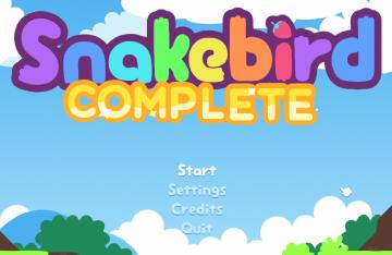
snakebird main menu start exit credits options
Snakebird
The UI in the image features a colorful and playful design, aligning with the game’s whimsical theme. The main title, "Snakebird COMPLETE," is prominently displ...
options (settings menu)
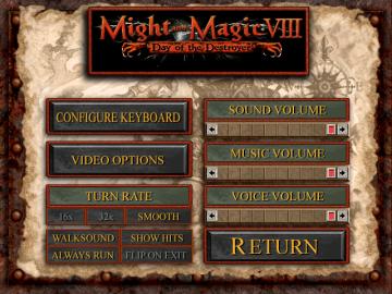
Might and Magic 8: Day of the Destroyer
The user interface (UI) in the picture showcases the settings menu for the game "Might and Magic VIII: Day of the Destroyer." UI Labels and Features: 1....