rewind symbol from a cutscene
Description
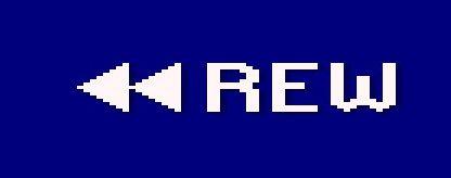
The user interface features a bold, white label reading "REW" in a pixelated font, indicating the function for rewinding. To the left of this label, there are two left-pointing arrow icons, which visually reinforce the action of moving backward or returning to a previous point. The background is a solid blue, creating strong contrast with the white text and symbols, enhancing readability. The simplicity of the design emphasizes functionality over decorative elements, making it clear for users to understand the purpose at a glance. The overall layout efficiently conveys the rewind action in a straightforward manner.
Software
Hotline Miami 2
Language
English
Created by
 M S
M S
Sponsored
Similar images
benefity, nastavení, platby, váš účet
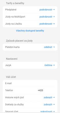
Rekola
Tento uživatelský rozhraní (UI) představuje nastavení a informace o účtu v mobilní aplikaci. Následující popis se zaměří na jednotlivé prvky: 1. Tarify a ben...
walls
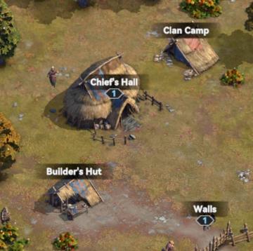
Viking Rise
The user interface (UI) in the image features several key labels and elements that are essential for gameplay and navigation. 1. Chief's Hall: This struct...
pay to unlock, survive to unlock
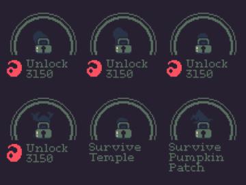
20 Minutes Till Dawn
The image features a UI layout typical of a game menu, focusing on unlocking various levels or challenges. Here’s a breakdown of the labels and features: 1. ...
spend skill points tutorial
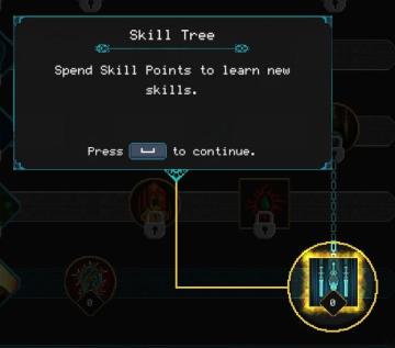
Children of Morta
Skill Tree: Title indicating the interface section for skill management. Spend Skill Points: Instructions on how to use skill points to acquire new...
choose playmode: classic, endless or expert
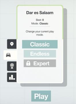
Mini Motorways
The user interface presents a minimalist layout with a soft, calming color palette. At the top, the location "Dar es Salaam" is prominently displayed, providing...
press and hold to purchase runes
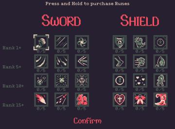
20 Minutes Till Dawn
The UI presents a menu for purchasing runes categorized under "Sword" and "Shield." Labels and Features: Title and Instructions: At the top, t...
log out button
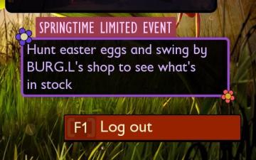
Grounded
The user interface presents a vibrant, engaging design centered around a "Springtime Limited Event." The title, prominently displayed in a purple box with decor...
decrypting (hacking into computer console)
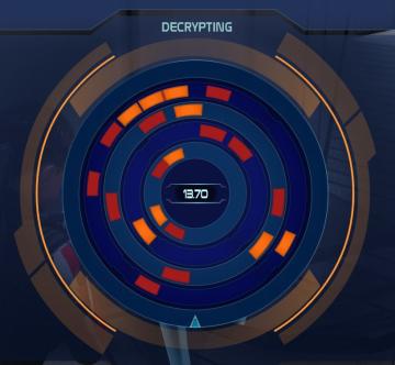
Mass Effect 1
The user interface displays a circular progress indicator titled "DECRYPTING" at the top, emphasizing its primary function. This title suggests that the operati...