red worker ant creature card
Description
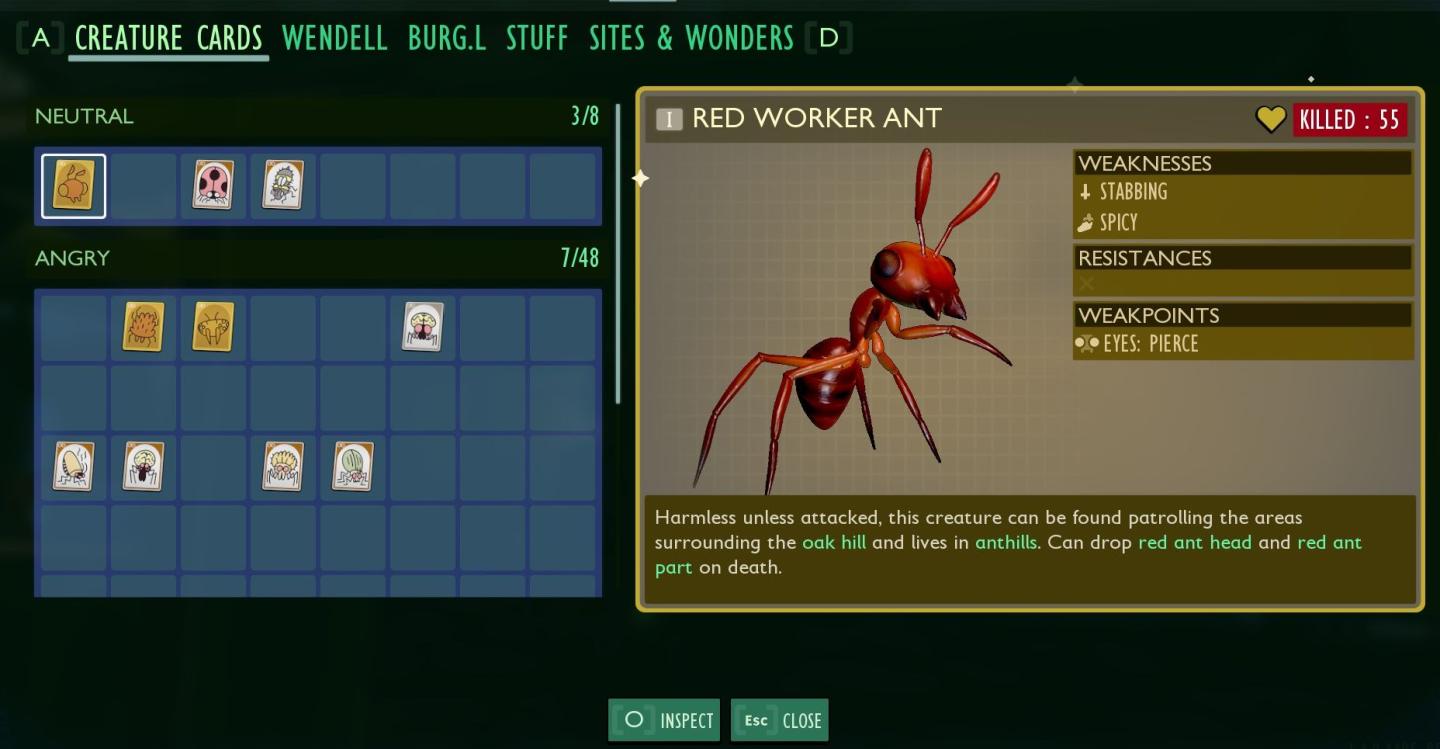
The user interface (UI) features are organized into several sections, primarily focusing on creature cards. The main title, "CREATURE CARDS," indicates the purpose of this screen, with highlighted character names like "Wendell" and "Burg.L," which may be characters relevant to the game.
To the left, creature categories are separated into "NEUTRAL" and "ANGRY," indicating the behavior of the creatures. Below each category label, icons represent different creatures, providing a visual identification tool.
In the upper right corner, the selected creature, "RED WORKER ANT," is displayed prominently with its image and a unique identifier. Key statistics and details follow, including "KILLED: 55," which tracks the player's interactions with this species.
Additional characteristics such as "WEAKNESSES," "RESISTANCES," and "WEAKPOINTS" are clearly labeled, offering strategic information for gameplay. A descriptive text box provides lore or context about the creature, enhancing player engagement.
Beneath the creature information, interactive buttons labeled "INSPECT" and "CLOSE" allow users to either view more details about the creature or exit the screen. The layout maintains a structured form that prioritizes functionality and ease of navigation while keeping visual elements concise and clear.
Software
Grounded
Language
English
Created by
 M S
M S
Sponsored
Similar images
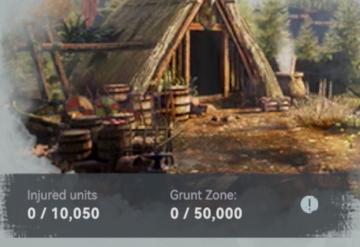
infirmary: injured units, grunt zone
Viking Rise
The UI features in the image present key information related to a game interface, likely focused on unit management and resource tracking. 1. Injured Units...
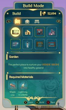
build mode, construct a garden, track required materials
Spiritfarer: Farewell Edition
Title: "Build Mode" Clearly indicates the current mode of operation within the UI. Currency Display ("52,694") Shows a numerical balance, likel...
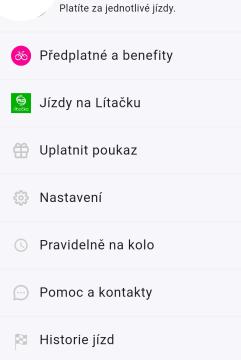
menu, platíte za jednotlivé jízdy, předplatné a benefity
Rekola
Na obrázku vidíme uživatelské rozhraní aplikace pro platby a služby související s jízdou. Hlavní funkce a popisky jsou následující: 1. Předplatné a benefity...
you have acquired thorn
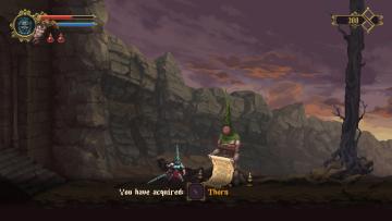
Blasphemous
The user interface features a combination of elements that convey important game information and enhance user experience. At the top left, a health bar is repr...
technology statistics: age progression, researched techs, map % explored
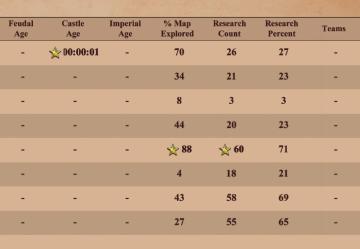
Age of Empires 2 Definitive Edition
The table presents a structured format for displaying gamerelated metrics, likely from a strategy or simulation game. Key features include: 1. Age Metrics...
právě využíváte, jízdy na lítačku, jízdy na multisportku, předplatné
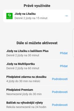
Rekola
Na obrázku vidíme uživatelské rozhraní mobilní aplikace, které je zaměřené na správu jízd a předplatných. Hlavní část rozhraní se skládá z několika sekcí a funk...
credits screen, back button
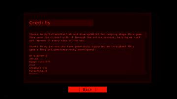
Lethal Company
The UI consists of a redonblack color scheme, contributing to a stark and intense visual presentation. At the top, the label "Credits" clearly identifies the...
snakebird main menu start exit credits options
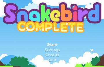
Snakebird
The UI in the image features a colorful and playful design, aligning with the game’s whimsical theme. The main title, "Snakebird COMPLETE," is prominently displ...