a tiny army of soldiers
Description
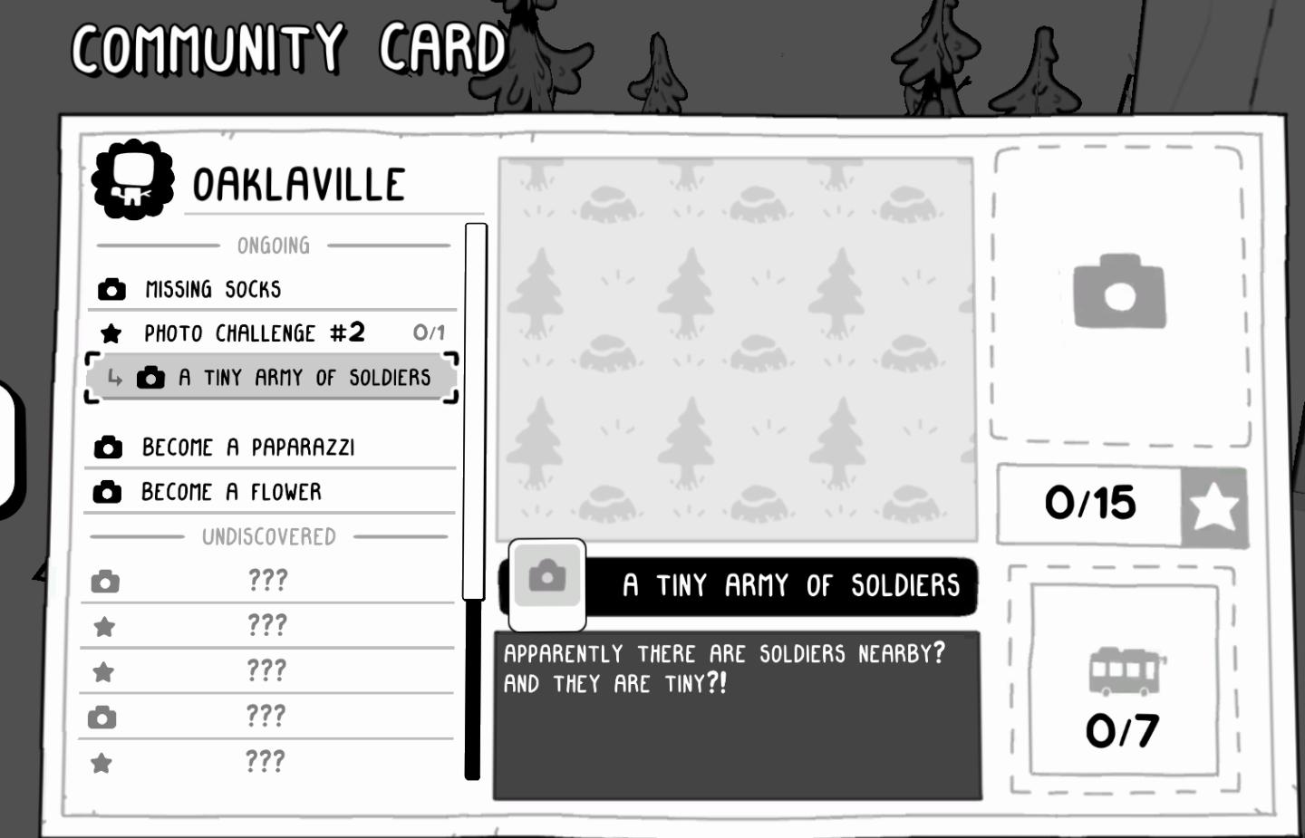
The "Community Card" UI features a clean, minimalist design primarily in black and white, with playful graphic elements.
Main Sections and Features:
-
Title Bar:
- At the top, labeled "COMMUNITY CARD," indicating the purpose of the window. Below it, "OAKLAVILLE" specifies the region or context.
-
Ongoing Tasks:
- A list of current challenges such as "MISSING SOCKS" and "PHOTO CHALLENGE #2 (0/1)" indicates progress, with a clear numerical system to track completion.
-
Active Challenge:
- The active challenge, "A TINY ARMY OF SOLDIERS," is highlighted, making it easy for users to focus on their current objective. This section includes an image placeholder (camera icon), likely for submitting a photo as part of the challenge.
-
Task Descriptions:
- A text box provides context for the challenge: "Apparently there are soldiers nearby? AND THEY ARE TINY?!", enhancing user engagement.
-
Additional Tasks:
- Below the ongoing section, options like "BECOME A PAPARAZZI" and "BECOME A FLOWER" are listed, offering variety in user interaction and quests.
-
Undiscovered Section:
- Below the discovered tasks, placeholders for undiscovered challenges are marked with "???", creating intrigue and encouraging exploration.
-
Progress Indicators:
- At the right, progress bars for tasks with numerical indications (e.g., "0/15" and "0/7") visually represent how much progress the user has made, easily understood by players.
Form:
The UI employs a soft, cartoonish aesthetic with rounded corners and a friendly font, making it inviting. The use of simple icons (like the camera) supports intuitive navigation, while the monochromatic scheme allows for easy readability.
Overall, the UI balances functionality with a fun design, encouraging users to engage and complete tasks within the game environment.
Software
TOEM
Language
English
Created by
 M S
M S
Tags
Sponsored
Similar images
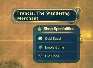
francis shop's specialties
Spiritfarer: Farewell Edition
The UI features a rectangular panel with a rounded border at the top displaying the name "Francis, The Wandering Merchant." This title is emphasized with a cont...
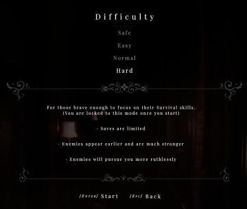
hard difficulty
Maid of Sker
The UI in the picture presents a difficulty selection screen for a game, featuring a dark, atmospheric background that enhances its immersive quality. ...
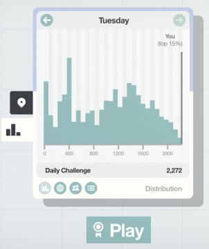
daily challenge score distribution
Mini Motorways
The user interface (UI) presented features a clean and organized layout, emphasizing clarity and functionality. At the top, a large label shows "Tuesday," ind...
Agree to privacy policy or reject all and exit game
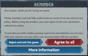
Viking Rise
tast inn privat spill kode
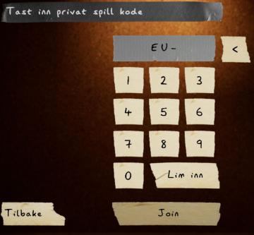
Phasmophobia
UIet har flere nøkkelfunksjoner. Øverst finner vi en tekstboks med teksten "Tast inn privat spill kode," som indikerer at brukeren skal skrive inn en kodestren...
quests, sanity, ghost activity
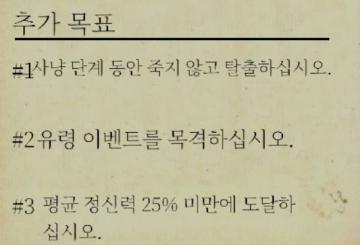
Phasmophobia
이 사진은 특정 목표를 제시하는 UI(사용자 인터페이스) 레이블을 포함하고 있습니다. 각 항목은 번호와 함께 구분되어 있으며, 사용자가 달성해야 할 목표를 명확히 전달...
alert: too soon for dangerous glades
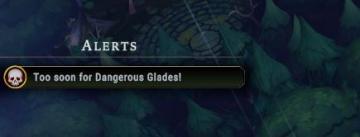
Against the Storm
The image features a user interface (UI) alert section labeled "ALERTS." This section is designed to convey important notifications to the player. The text "Too...
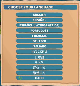
choose your language
Floppy Knights
The user interface (UI) in the picture features a language selection menu. Here’s a breakdown of its elements and functions: 1. Title: Label: "CH...