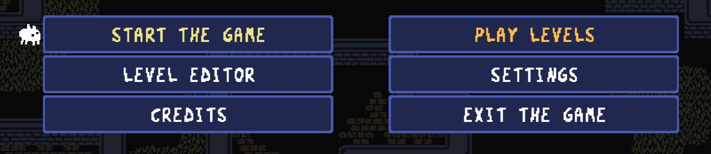
main menu of a game
Description
The user interface (UI) in the picture showcases a simple and intuitive design, aimed at making navigation straightforward for players.
UI Labels and Functions:
-
Start the Game: This label indicates the primary action for players to engage with the game. It is prominently placed, encouraging users to begin playing immediately.
-
Level Editor: This feature allows players to create and modify their own game levels. It appeals to creative players who wish to design their gameplay experience.
-
Credits: Acknowledges the contributors to the game. This label provides a sense of appreciation for the development team and other stakeholders.
-
Play Levels: This option likely allows users to select and play predefined levels rather than creating their own, catering to those who prefer structured gameplay.
-
Settings: This feature typically provides options for adjusting game settings, such as volume, controls, and graphics, enhancing user comfort and customization.
-
Exit the Game: This label provides a clear option for users to terminate the game, ensuring they can easily leave the interface when desired.
Design and Aesthetics:
- The buttons have a rectangular shape with contrasting colors, making them stand out against the darker background.
- Text is displayed clearly, with varying font weights to differentiate between primary actions (like "Start the Game" and "Play Levels") and secondary options (like "Credits").
- An animated character or icon appears to the top left, likely serving as a playful branding element that adds personality to the interface.
Overall, the UI is functional, clearly organized, and visually appealing, making it easy for players to navigate their options effectively.
Software
Baba Is You
Language
English
Created by
 M S
M S
Tags
Sponsored
Similar images
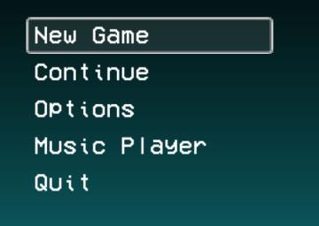
main menu, you can access music player
LISA: The Painful - Definitive Edition
The UI presented in the image features a vertical menu with five options, each serving distinct functions for navigating a game or application. 1. New Game...
main menu (save game, load game, settings, exit..)
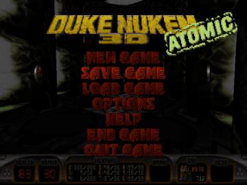
Duke Nukem 3D Atomic Edition
The user interface (UI) in the image features a bold, stylized title "DUKE NUKEM 3D" prominently displayed at the top, emphasizing the game’s identity. The word...
main menu
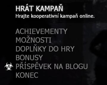
Left 4 Dead 2
Tento uživatelský rozhraní obsahuje několik prvků zaměřených na interakci uživatele s hrou. 1. HRÁT KAMPANĚ: Hlavní možnost, jejímž účelem je zahájit koop...
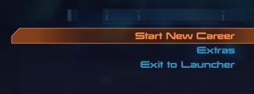
main menu: start new career, exit, extras
Mass Effect 1
The UI presents three main labels with distinct functions, each crafted for clarity and ease of navigation. 1. Start New Career: This primary option, highl...
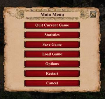
in-game main menu, load, save, restart
Age of Empires 2 Definitive Edition
The interface presents a Main Menu with a classic, vintage aesthetic, highlighted by ornamental borders and a textured background. The menu features a centraliz...
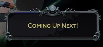
coming up next button in main menu
Hades II Early Access
The UI features a prominent text label that reads "COMINGS UP NEXT!" in a bold and eyecatching font, indicating an upcoming segment, likely in a video or strea...
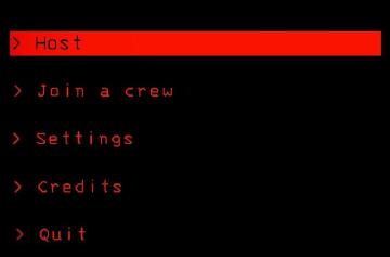
host game, join a crew, settings, main menu
Lethal Company
The interface features a predominantly black background, creating a stark contrast with red and white text, which enhances readability. Host: This label...
Main menu: continue, start new game,

Getting Over It with Bennett Foddy
The interface presents a minimalist design that prioritizes functionality. The title "Getting Over It with Bennett Foddy" is prominently displayed at the top, e...