select a scenario to play
Description
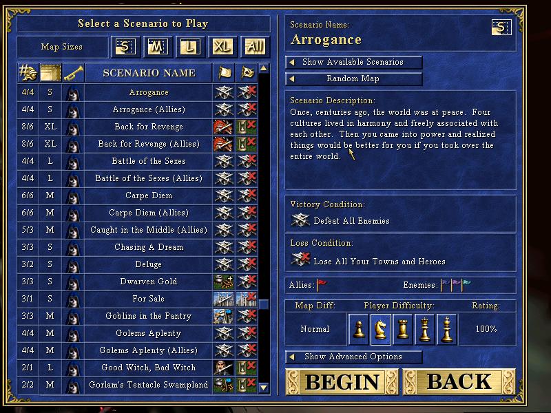
The user interface (UI) displayed in the image is designed for selecting scenarios in a strategy game. Here’s a breakdown of its features and labels:
Main Features
-
Scenario Selection Table:
- Lists various scenarios on the left side. Each row shows:
- Scenario Size (indicated by a fraction, e.g., 4/4).
- Scenario Name (e.g., "Arrogance").
- Allies and Enemies Indicators (symbols to show if allies are included).
- Lists various scenarios on the left side. Each row shows:
-
Map Size Options:
- Buttons labeled with sizes (S, M, L, XL) at the top left, allowing players to filter scenarios by map size.
-
Scenario Name Display:
- The selected scenario name ("Arrogance") is prominently displayed at the top right.
-
Scenario Description:
- A text box that provides a narrative context for the selected scenario.
-
Victory and Loss Conditions:
- Clearly defined goals displaying what conditions must be met to win or lose within the scenario.
-
Allies and Enemies Section:
- Displays icons indicating allies and enemies within the game setup.
-
Difficulty and Rating Information:
- Sections that indicate the map difficulty ("Normal"), player difficulty, and a rating (100%).
-
Buttons:
- Begin: Starts the selected scenario.
- Back: Returns to the previous menu.
- Show Available Scenarios: A toggle to display additional scenarios.
- Show Advanced Options: Access to more detailed settings for the game.
Form and Function
- Form: The layout is structured and organized, using tables and clear visual distinctions between sections. The use of tabs and buttons makes it intuitive for players to navigate.
- Function: Each feature serves a specific purpose that enhances user experience, allowing users to easily filter, select, and learn about the game scenarios before committing to play.
Overall, the UI is designed for clear navigation, allowing players to select and understand their scenarios quickly and efficiently.
Software
Heroes of Might and Magic 3: Complete
Language
English
Created by
 M S
M S
Tags
Sponsored
Similar images
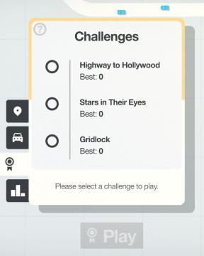
select a challenge to play
Mini Motorways
The user interface (UI) in the picture features a clean layout focused on selecting challenges. At the top, there is a bold label reading "Challenges," indicati...
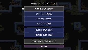
select levels to play
Baba Is You
The user interface (UI) in the image presents a functional menu for managing game save slots, with a focus on various options related to gameplay. Here are the...
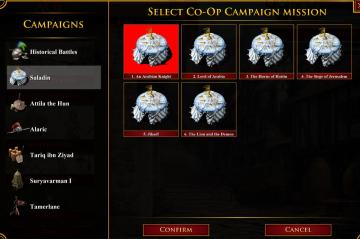
select coop campaign mission
Age of Empires 2 Definitive Edition
The user interface displays various campaign options divided into two sections: the left pane features sidenavigation labels for different campaigns, while the...
select difficulty
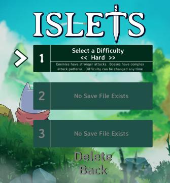
Islets
The user interface (UI) in the image features several key elements designed for selecting game settings and navigating the menu. 1. Title: At the top, the...
options menu: change user settings, select mods
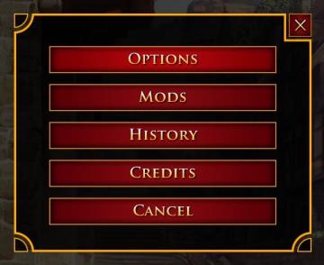
Age of Empires 2 Definitive Edition
The user interface presents a vertical list of labels within a rectangular box with rounded corners. Each label serves a specific function: 1. OPTIONS: Thi...
equiped item, selected item, resources
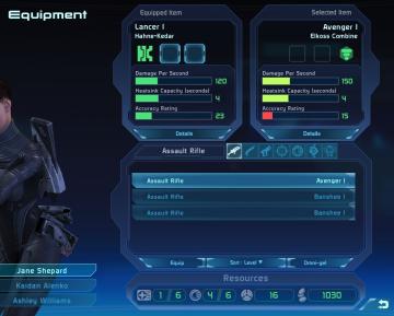
Mass Effect 1
The user interface features a left sidebar displaying character information, including the player character's name, "Jane Shepard," and squad members: Kaidan Al...
clear save select delete

Mages of Mystralia
The UI features in the image consist of three primary labels: "Clear save," "Delete," and "Select," each of which serves specific functions. 1. Clear save:...
go to chapter selection
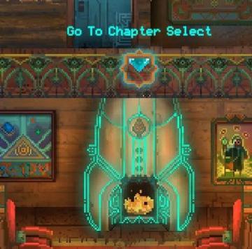
Children of Morta
Go To Chapter Select: Main action label indicating navigation to a chapter selection menu. Arrow Icon: Indicates that the label is interactive, sugg...